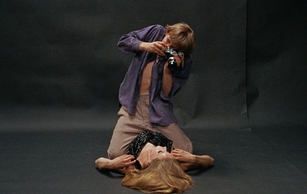
Film still of Blow-Up © RR
A legendary feature film with assertive colors, filmed in the dazzling setting of "Swinging London", Blow-Up (Grand Prix winner in 1977) constituted a positive turning point in the career of Michelangelo Antonioni. Highly regarded for his work with Paolo Sorrentino, cinematographer Luca Bigazzi evokes the visual impact of this film upon its release and his artwork in restoring the original colors.
What impact did Blow-Up make upon its release?
Blow-Up was greeted as a very innovative film due to the firm position it took cinematographically, which was very courageous at that time. This color feature film was conceived at a time when Italian cinema was just beginning the transition from black and white to color. A number of films directed in color were conceived as if they were black and white. Directors continued to play uselessly with backlighting, which was no longer necessary with color. The result was that everything seemed false on-screen. In this regard, the cinematography of Blow-Up represented a major leap forward. The transition between black and white and color was very difficult in Italy, especially in the schools, which were by tradition very conservative.
In what way was the cinematography of Blow-Up innovative?
Antonioni and Carlo Di Palma, his cinematographer, gambled on making less use of light in order to achieve more realism and modernity. At the same time, they decided to emphasize the colors of the settings and the costumes. These two choices gave the film its visual identity. For example, Antonioni had the grass at the crime scene repainted in green. You can understand his decision by looking more carefully at the edges of the lawn, which have a duller color. The colors in the main character's photography studio are particularly accentuated as well. The director made very calculated decisions chromatically.
How did the restoration go?
Overall, it was difficult. We first started with a copy completely devoid of all colors except red and white. It was a vintage copy that had largely deteriorated. This is also a very alarming indication of the conservation of films in metrocolor. We thus started again using a more recent negative with colors that could be recognized. Since we didn't have any precise instructions, the film was cleaned. We then had to reinterpret its colors while trying to be as subtle as possible in order to respect what we had in front of our eyes. We didn't make any major changes since there's always the risk of making an error in judgment. In the past, restorers tried to make sure that the colorimetry was clearer, more somber, greener, redder, etc. Today, digital technology allows you to push back the limits, but it's also more dangerous in ethical terms.
There's a raging debate on this subject…
I think that we must come to an agreement on how our cinematographic heritage is restored. The room for arbitrariness is too great. It's hard to put yourself in the shoes of a cinematographer who worked with other technical means, formats, lighting and film speeds, all of which are different from today.